Live Client
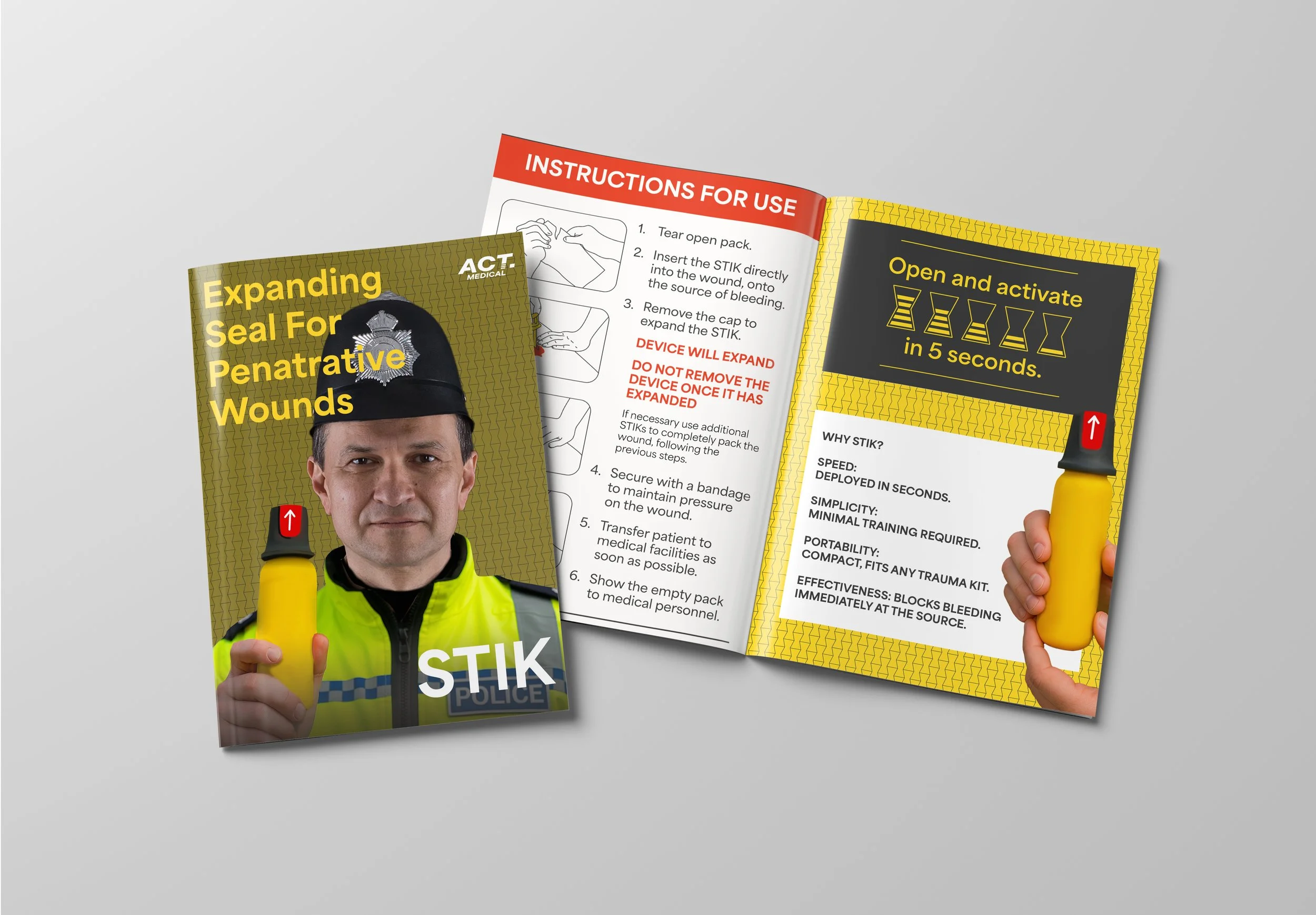
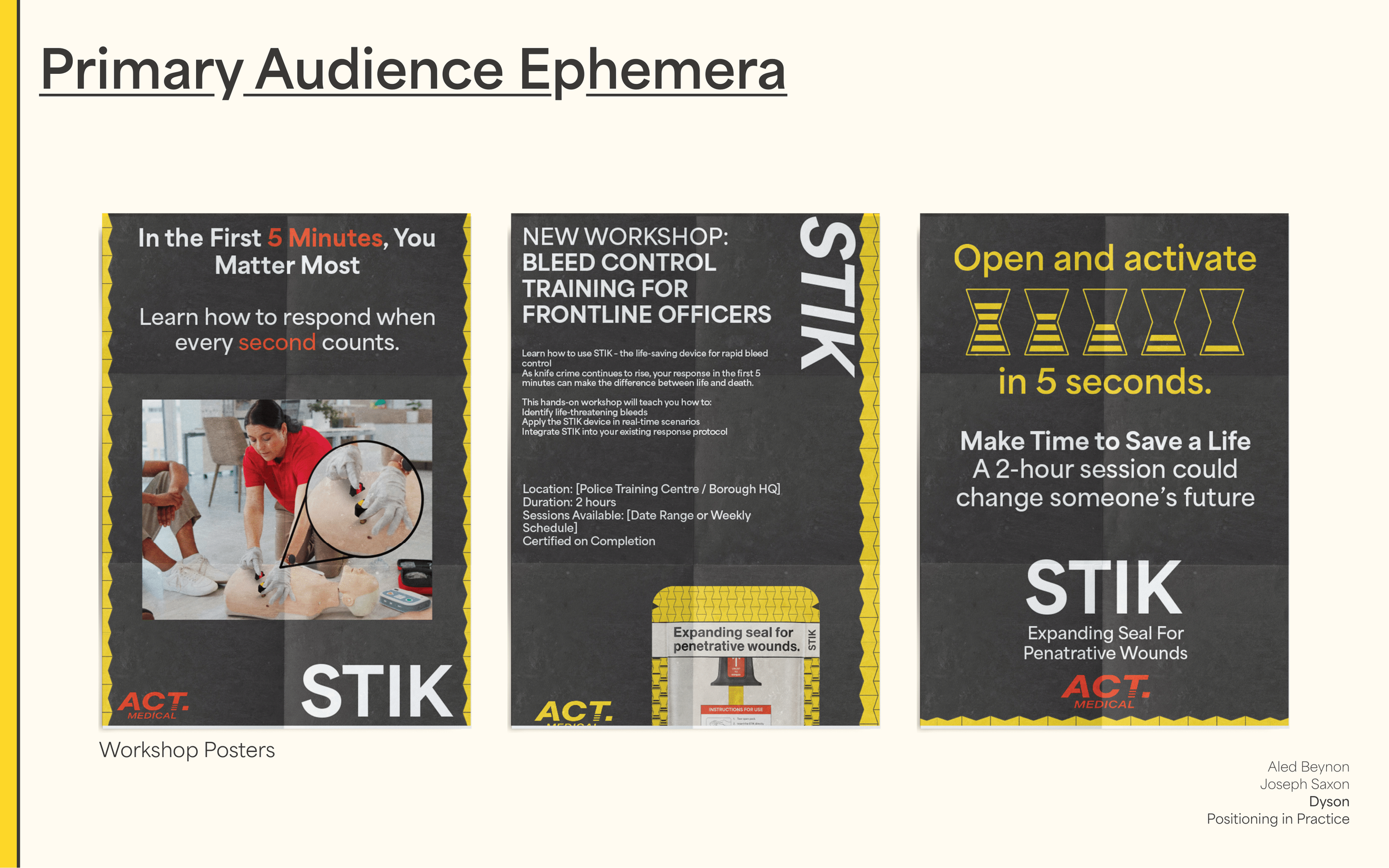
This live brief focused on branding a completely new emergency response product, designed primarily for first responders such as paramedics, police, and fire services. Working in collaboration with ACT Medical and Dyson, we were challenged to name, classification, and create a visual identity system for the device, as well as communicate its purpose and usability across multiple touchpoints.
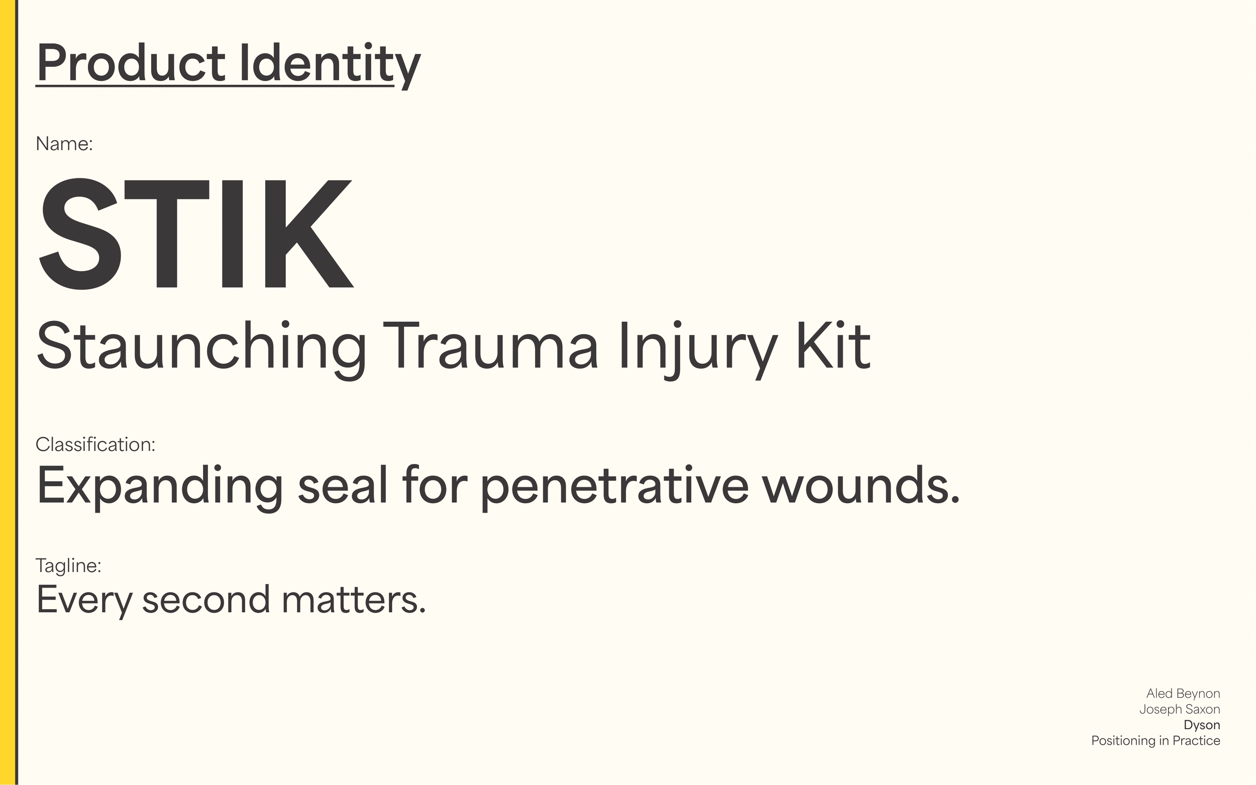
We named the product STIK—a name chosen for its simplicity, memorability, and association with quick, precise use. The design system uses bold, legible typography and a bright, recognisable colour palette—striking enough for high-pressure environments but carefully balanced to avoid visual overwhelm.
The project required a strong messaging hierarchy to, Identify the real-world problem STIK solves, Explain how the device works, Adapt the message for various audiences, including potential third-party sponsors.
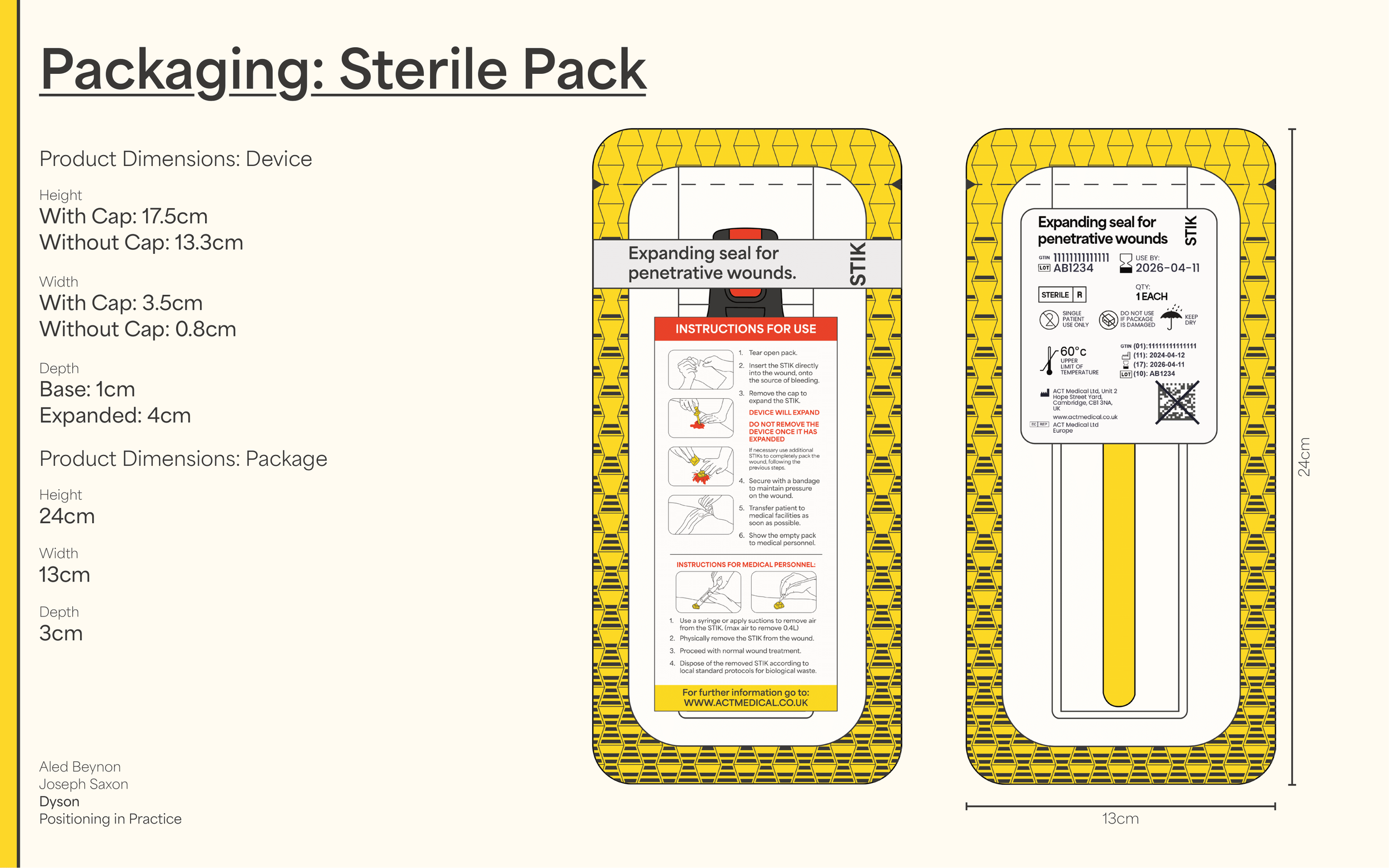
Outcomes included packaging concepts, instruction interfaces, on-site signage, and awareness materials, all unified through a consistent and functional brand language tailored for rapid comprehension in emergency scenarios.